Heatmaps That Drive Investment Decisions
Coloring a capability map is easy and oddly satisfying. Coloring it in a way that changes where money goes is the actual skill — and it starts with being honest about what the colors mean.
A capability map answers "what do we do?" A heatmap answers the harder question: "where should the next dollar go?" This issue is about turning a colored map into an investment decision without fooling yourself with the colors.
Heatmaps That Drive Investment Decisions
Coloring a capability map is easy and oddly satisfying. Coloring it in a way that changes where money goes is the actual skill — and it starts with being honest about what the colors mean.
A capability heatmap is a capability map with a layer of color: each capability shaded to show some attribute — maturity, performance, risk, strategic importance, investment. Done well, it is the single most persuasive artifact in business architecture, because it turns an abstract inventory into a picture an executive can act on in ten seconds. Done badly, it is a mood ring for the enterprise: colorful, confident, and meaningless.
Decide what the colors mean — exactly
The first failure is vagueness. A map shaded red-amber-green where no one can say precisely what red means is decoration. Before coloring anything, define the dimension and the scale in words a stranger could apply the same way you would. "Maturity" needs levels — what does a 2 look like versus a 4, in observable terms? "Importance to strategy" needs to be traceable to actual objectives, not vibes. If two reasonable people would shade the same capability differently and could not resolve it by talking, the scale is not yet defined.
One dimension is a picture; two is a decision
A single-dimension heatmap is informative. The decision-grade version overlays two. The classic and most useful pairing is strategic importance against current maturity. That combination sorts every capability into four meaningfully different situations, and the action implied by each is different — which is the whole point of doing it.
Important and weak is the underinvestment quadrant: capabilities the strategy depends on that the business is not good at yet. This is where the next dollar usually belongs, and it is exactly the quadrant a single-color map hides. Important and strong is where you protect and sustain — do not let a strength quietly decay because it stopped getting attention. Unimportant and weak is fine; resist the urge to gold-plate a capability no objective needs. Unimportant and strong is the over-investment quadrant — capable at something that no longer matters much, and a candidate for redirecting effort elsewhere. Two dimensions, four conversations, each leading somewhere different.
Add investment, and the gaps light up
Now overlay a third fact lightly: where money is currently going. The most valuable thing a heatmap can show is a mismatch — a capability that is important and weak but receiving no investment, sitting next to one that is unimportant and strong and quietly absorbing a large program budget. You do not need a statistic to make the case; the picture makes it. This is the moment a heatmap stops being a status report and becomes a reallocation argument.
Guard against confident nonsense
The danger of heatmaps is precisely their persuasiveness: a colored map looks authoritative whether or not the colors are earned. Three habits keep them honest. Ground the ratings in evidence, not a show of hands in a workshop — performance data, audit findings, real incidents, customer outcomes. Record who rated each capability and on what basis, so a color can be challenged and defended rather than simply believed. And re-rate on a cadence, because a heatmap frozen at last year's offsite is steering by a stale instrument. A heatmap's authority should come from the rigor behind the ratings, never from the fact that it is colorful.
A worked example: the two reds that meant opposite things
A utility shaded its capability map by maturity and presented it to the board. Two capabilities came up red: "outage prediction" and "corporate event management." On a single-color map they looked like the same problem — two weaknesses to fix — and the instinct in the room was to fund both. Then the team overlaid strategic importance. Outage prediction sat squarely under the year's reliability objective; it was important and weak, the textbook place to invest. Corporate event management was important to no current objective at all; it was simply a capability the company had never been good at and never needed to be. Same color, opposite conclusions. One red was a priority; the other was a red herring.
Without the second dimension, the board would have spread money evenly across both, because both looked equally alarming. The two-axis view did not just rank the capabilities — it changed which ones counted as problems. That is the difference between a heatmap that informs and one that actually decides.
Choosing what to color
A heatmap is only as good as the dimension you choose to shade by, and the choice is not obvious. Maturity answers "how good are we?" Importance answers "how much should we care?" But others are worth a pass, each surfacing a different decision. Risk shows where a weakness is also a hazard — a capability that is weak and high-risk is a different conversation from one that is merely weak. Differentiation shows where a capability could be a competitive edge rather than table stakes, which changes whether "good enough" is actually good enough. Cost-to-serve shows where capability is expensive out of all proportion to its value. The mistake is trying to encode all of them in one rainbow map that ends up meaning nothing. Pick the two dimensions that bear on the decision in front of you, shade clearly, and make a separate view when a different decision needs different colors.
The cadence problem
The other failure is temporal. A heatmap is a snapshot, and snapshots age. A map shaded at last year's strategy offsite and never touched since is steering by an instrument that stopped reading months ago — and worse, it carries the authority of looking precise while being quietly wrong. The fix is unglamorous: re-rate on the same cadence as planning, record when each rating was last reviewed, and treat any color older than a cycle as a question rather than a fact. A heatmap earns trust not by being colorful, and not even by being right once, but by being kept honest on a rhythm the business can rely on.
One more guard is worth building in: separate the rating from the rater's stake in it. The team that owns a capability is rarely the most objective judge of how mature it is, for the same reason no one grades their own exam. Where it matters, triangulate — pair the owner's view with a number from outside (a performance metric, an audit result, a customer measure) and note when the two disagree. The disagreement is not a problem to be smoothed over; it is often the most useful thing on the map, because it marks a capability the organization does not understand as well as it thinks. Resolve it with evidence rather than seniority, and the heatmap keeps the authority it needs to actually move money.
Used this way, the heatmap is where everything in the last few issues pays off. The capability map gave you the structure; cross-mapping connected it to strategy and funding; the heatmap renders all of it as a single, decision-ready picture — and points, unambiguously, at where the next dollar will do the most good. The worksheet below is how to do the rating without fooling yourself.
Capability Heat Maps Lie
The capability heat map — red, yellow, green — is the business architect’s most overused artifact. It looks decisive. It looks data-driven. It is, almost always, neither.
The ratings come from interviews, surveys, and gut feel. The colors are the average of many opinions, often loudly held. The heat map becomes the slide that gets shown to leadership, and leadership treats it as if it came from a sensor.
The map is useful for triggering discussion. It is dangerous as a basis for investment.
Before you publish a heat map, ask yourself: what would change if a cell went from red to green? Is there a measurable definition? If not, you’re running a popularity contest about capabilities. Calibrate, or don’t color.
Capability Heatmap
A capability heatmap is a capability map with each capability color-coded against a defined dimension — commonly maturity, performance, risk, strategic importance, or investment level. It turns a structural inventory into a visual that supports prioritization at a glance.
Its usefulness depends entirely on the rating behind the color. A defined, evidence-based scale (what exactly does "low maturity" mean, and how do we know?) makes the map a decision tool; an undefined red-amber-green wash makes it decoration that merely looks authoritative.
The decision-grade form overlays two dimensions — most often strategic importance against maturity — to separate capabilities that are important but weak (where investment usually belongs) from those that are strong but no longer strategic (where it can be redirected). Add current investment as a third layer and the mismatches become the argument.
Capstera turns business architecture into a living, governed model — capability maps, value streams, heatmaps, and strategy-to-execution cross-mapping in one place.
Explore the platform →Turn a heatmap into a shortlist: rate on two axes, let the sheet place each capability in a quadrant, and surface the underfunded-but-critical ones.
Subscribe to get this free download →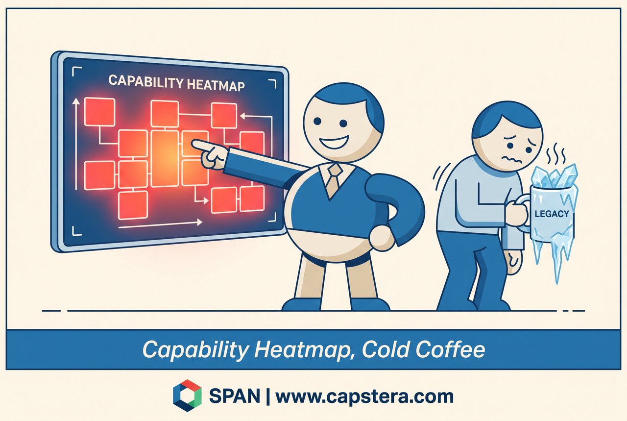
A vendor pitched savings so vast,
Their ROI numbers were classed.
We signed on the line,
Felt quite proud and quite fine —
Then the true cost arrived rather fast.
Comprehensive Chemical Manufacturing Business Architecture Reference Model designed for enterprise architects and strategy consultants to optimize operations and drive growth.
View in the store →